If you’ve ever used Spotify, you’ve probably noticed its unique look and feel, including the font that’s part of its brand identity. The Spotify font isn’t just any typeface—it’s carefully chosen to make the app look friendly, modern, and easy to read. In this article, we’ll dive into everything you need to know about the Spotify font, from its history to how it shapes the user experience, and even how you can use similar fonts in your designs.
Ready to explore the story behind this iconic font? Let’s get started!
What is the Spotify Font?
Spotify’s font is not only iconic but also an essential part of its brand identity. So, what is the font Spotify uses?
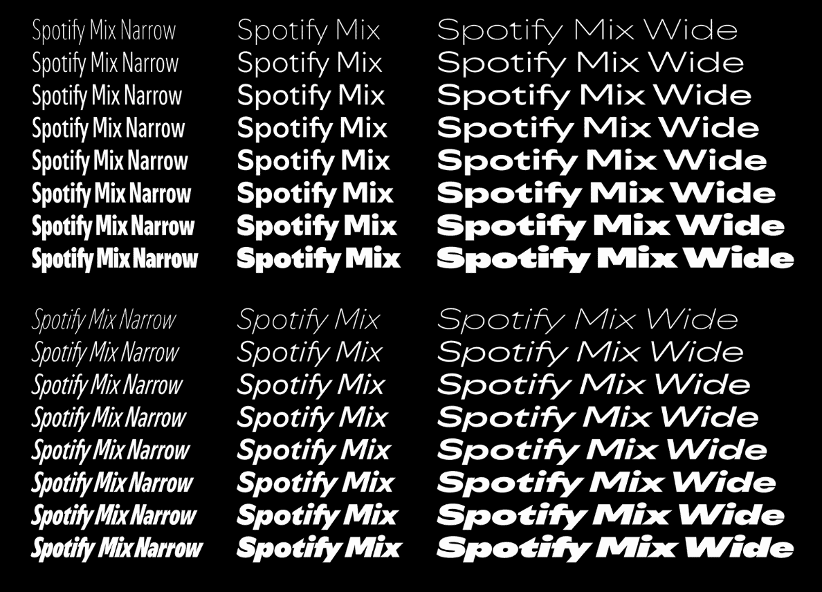
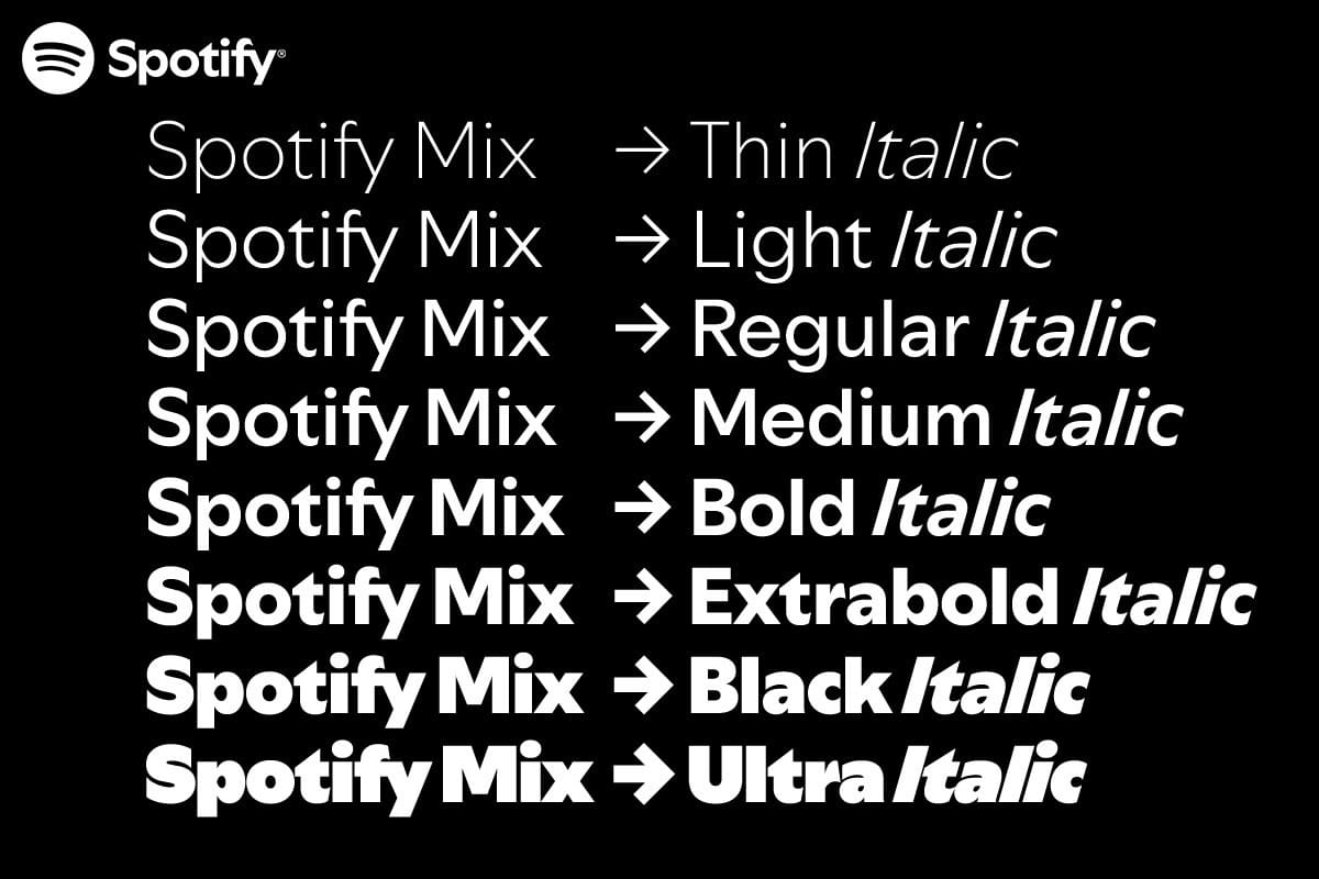
Spotify uses a sans-serif font called Circular. This font was designed by Swiss designer Laurenz Brunner.
Circular has become an integral part of Spotify’s brand because of its modern, clean look that works well on digital interfaces. Before adopting Circular, Spotify used Gotham, another well-known sans-serif font.
The circular is ideal for digital applications thanks to its simple lines, easy readability, and contemporary feel. This font helps users easily recognize Spotify’s content, from the logo to various elements across the app interface.
Why Did Spotify Choose Circular as Its Font?
Spotify chose Circular not only for its aesthetics but also for its friendly and approachable vibe. With its rounded edges, Circular conveys a welcoming feel that aligns with Spotify’s mission to be accessible to everyone around the globe.
Choosing Circular helped Spotify create a unified and modern brand image. With its minimalist and refined characteristics, this font gives users a sense of comfort when using the app, while reinforcing Spotify’s brand identity in the minds of users.
How the Spotify Font Has Evolved Over Time
Spotify’s font has gone through several phases to keep up with the brand’s development. Initially, Spotify used Gotham, a bold sans-serif font with a strong, edgy design. However, as the app evolved and gained global recognition, Spotify needed a new font to reflect a softer, more approachable image.
Spotify eventually transitioned to Circular, creating a cohesive and friendly look. Circular allows them to maintain brand recognition while adapting to the app’s modern style. This change is a prime example of how a major brand adjusts its visual identity to align with its growth and long-term goals.
How to Get a Similar Font to Spotify’s
If you’re looking for fonts similar to Circular (the font used by Spotify) or even fonts with a vibe similar to the Facebook font (which also uses a clean sans-serif style), here are some great options. These modern sans-serif fonts have rounded edges, excellent readability, and a friendly, approachable feel, making them ideal for both digital and print use.
- Montserrat: This font shares many similarities with Circular, especially in its rounded edges and easy readability. Montserrat is available for free on Google Fonts, making it perfect for digital projects or websites.
- Poppins: Another modern sans-serif font, Poppins has similar characteristics to Circular and is also free on Google Fonts.
- Proxima Nova: Although slightly different, Proxima Nova retains the same modern and readable qualities that make Circular effective.
Using these fonts, you can achieve a similar look to Spotify for your projects without needing to purchase the Circular license.
How the Spotify Font Impacts User Experience

Fonts are not just a visual element; they also impact user experience. For Spotify, Circular not only makes the brand stand out but also makes the app easier for users to navigate and read.
A font that is modern and easy to read, like Circular, reduces visual fatigue—especially important for users who spend a lot of time browsing for music, podcasts, and other content on the platform. Circular also provides a comfortable, friendly feel, making users more engaged and loyal to the Spotify brand.
Conclusion
Spotify’s font choice plays a crucial role in its brand identity and user experience. The decision to use Circular helped Spotify create a friendly, approachable look that resonates with a global audience. For those inspired by the Spotify font, there are many similar options available, such as Montserrat and Poppins, which can help you bring a bit of Spotify’s aesthetic into your projects.
Start exploring the world of typography today and see how a well-chosen font can elevate your brand!
Frequently Asked Questions About the Spotify Font
Can I download the Spotify font?
No, the Spotify font, Circular, is a licensed font. This means it is not freely available for download or commercial use without purchasing a license. Circular was designed by Swiss designer Laurenz Brunner and is used exclusively by Spotify as part of its branding. If you want to use Circular, you would need to buy a license from a reputable font provider, such as Lineto, which distributes the typeface.
However, if you’re looking for similar fonts, there are alternatives that capture the clean, rounded look of Circular. Fonts like Montserrat and Poppins are free on Google Fonts, and they share a similar aesthetic. While they’re not identical, they can work well for projects requiring a similar modern and friendly look.
Is the Spotify font free?
No, Circular is not a free font. It’s a proprietary typeface, which means it requires a purchased license to use legally, especially in commercial projects. Spotify has licensed Circular specifically to maintain its distinct brand identity, so using it without a license could lead to copyright issues.
If you’re looking for a free alternative with a similar feel, Montserrat and Poppins are both highly recommended. These fonts are available for free on Google Fonts and are widely used in both digital and print projects due to their clean, rounded designs, similar to Circular’s.
What font is similar to Spotify’s for web use?
For web use, Montserrat and Poppins are excellent alternatives to Circular and are freely available through Google Fonts. Montserrat is inspired by urban signage and has a clean, geometric look that feels modern and approachable, much like Circular. Poppins is another sans-serif font with rounded edges, giving it a friendly and contemporary feel, which works well for digital interfaces.
These fonts are optimized for web use and are compatible with most browsers, making them easy to implement on websites. If you’re aiming for a design that evokes the same approachable and modern vibe as Spotify’s branding, either Montserrat or Poppins could be a suitable, free alternative.


