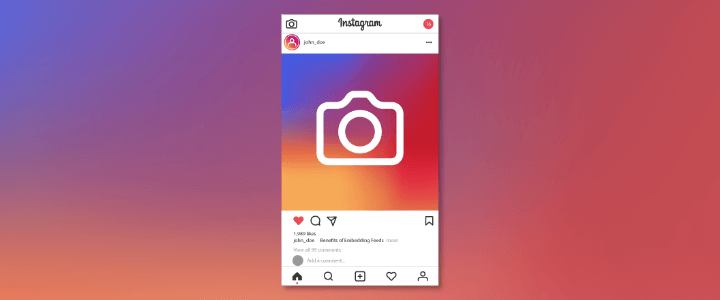
In this post, we’ll share some insights on how Instagram crafts an accessible Instagram Feed.
One of the main targets of the Instagram Accessibility team is to work on system-wide accessibility problems. A single product team can not solve these problems. For Instagram, accessibility development often centers around improving the experience for screen-reader users. Improving this experience, Instagram can also improve the experience of other accessibility cohorts. They include users who are visually impaired and people with limited mobility and dexterity.
Why Instagram Feed?
While prioritizing surfaces for accessibility Instagram focussed intently on the user. Instead of making a series of one-off changes to UI labels, which is typically how a lot of accessibility development is driven, Instagram tends to take a holistic approach. They considered how all users, not just screen-reader users use the Instagram app and prioritized surfaces that everyone uses. So, everyone can take advantage of more accessibility-minded development.
Based on this approach, the feed, which is the first surface users interact with was a great place to get started.
Instagram’s approach
On using TalkBack to navigate the feeds, Instagram found out that it could take over a minute to swipe from one post to the next since each visible UI element received individual focus.
The ability to quickly explore posts, which is something that Instagram normally associates with the Instagram experience, was completely missing. This was definitely not good and Instagram wanted every user to have the same great feeling of exploring when they scroll through Instagram’s feed, whether they use a screen-reader or not. In order to complete this, Instagram worked on optimizing some different areas:
Labeling
Instagram made sure that feed UI elements had appropriate accessibility roles and labels. Over time, they fixed many labels and aggregated labels for feed posts, putting the most related information to the users at the beginning, such as the author, type of post (e.g. image, video), and a description of this post. Getting this order correct is becoming very necessary and impactful and gave screen-reader users more control. So they can quickly skip over a post they were not interested in, find posts that are more interesting to them, and maintained the theme of seamless navigation.
UI Element Grouping
The most noticeable change Instagram made was condensing the focus hierarchy to show up each post with only two elements: the media and the post actions. These improvements simplified navigation by representing each individual post as one focusable element. And they reduced swipe time between posts from minutes to just seconds.
By grouping focus elements more intentionally, Instagram decreased the number of gestures it takes users to scroll through a post from as many as 30 swipes to just 2. This was important to achieving their goal of giving screen-reader users the experience of rapid discovery available on visual interfaces.
User Controls
The UI element grouping made the feed scrolling fast but also removed the focus on all post actions. In order to solve this and provide an optimized experience for screen-reader users, Instagram moved all main post actions (Like, Comment, Send Post, and Save) into one bottom sheet. Users can access it via:
- Custom actions on iOS (a feature that is famous and used by VoiceOver screen reader users)
- Or a separate button between feed posts on Android.
They also ensure that users could easily return to the previous, familiar, experience of interacting with each of the individual UI elements on a post if they want. They just need to double-tapping on the media object when the screen-reader is activated. This takes the user to a new screen containing a single post where every UI element is focusable again.
This post only describes how Instagram has improved its Feed for screen-reader users. There’s still more work to do on other Instagram features. And Instagram still keeps improving accessibility and creating new experiences that make all of us feel welcome.

