What makes Instagram Stories so captivating, even though they vanish after just 24 hours? In the visually dynamic realm of social media, they’re essential for grabbing and holding your audience’s attention. It’s not just about posting and moving on; it’s about making a lasting impact within that short window of visibility. And to achieve that impact, aesthetics play a crucial role. It all begins with mastering the dimensions of your Instagram Story.
Whether you’re an aspiring influencer, representing a brand, or simply sharing your daily adventures, understanding and using the correct story dimensions of Instagram are vital.
That’s exactly what we’ll explore in this blog.
We’ll cover everything from the basics to advanced optimization techniques for your stories, and we’ll take inspiration from brands and creators who are doing it right.
So, join us as we walk you through refining your stories, ensuring they not only get seen but also leave a memorable impression.
What Exactly Are Instagram Story Dimensions?
An image’s dimensions refer to its height and width, typically measured in pixels (PX), the tiny dots that form the image on a screen.
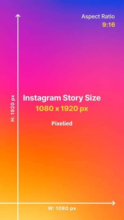
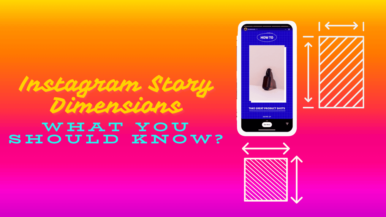
For Instagram Stories, the dimensions are 1080 PX by 1920 PX. This means the ideal image or video for Stories should be 1080 pixels wide and 1920 pixels tall, filling a standard smartphone screen. The aspect ratio is 9:16, representing the relationship between width and height.

While resolution also affects image quality, if you adhere to the correct dimensions, resolution generally falls into place. If your image is 1080 PX by 1920 PX, it’ll likely have a suitable resolution for Instagram. However, it’s helpful to understand the distinction:
- Dimension: This is the size of an image in pixels, like 1080 PX x 1920 PX. The recommended dimensions remain the same regardless of the screen size.
- Resolution: This refers to the number of pixels per inch (PPI), or pixel density, in the physical image. Higher resolution results in clearer images, while lower resolution may appear blurry or pixelated. Instagram doesn’t specify an ideal resolution for Stories, but a minimum of 72 PPI generally suffices for most screens. For comparison, an iPhone 14 has a PPI of 460.
What is Instagram Stories’ Safe Zone?
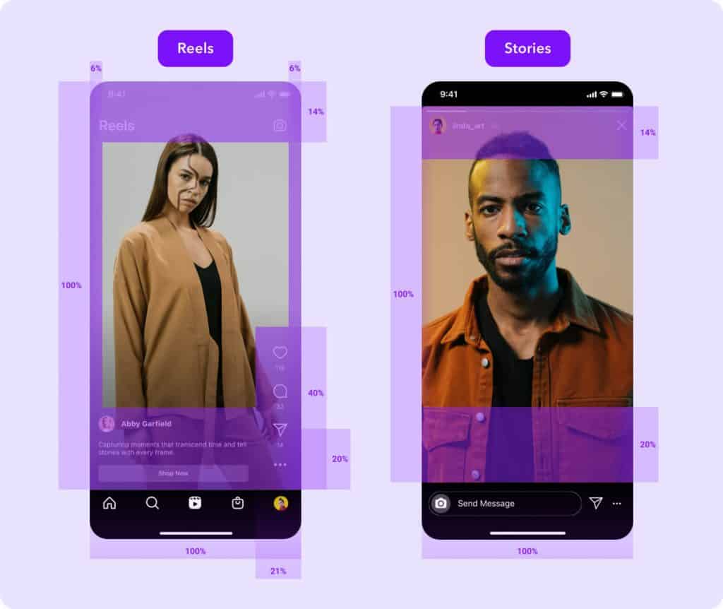
When someone views your Instagram Story, they see your image or video, along with details about your handle at the top and a message or “swipe up” bar at the bottom. These elements can cover part of your image, so it’s important to consider the Instagram Story “safe zone” – the area where these elements won’t obstruct or cut off your image, ensuring viewers can see it clearly. This concept also applies to Reels, where icons for likes and comments, along with space for the video’s description are present.

As you edit your Story, Instagram will display blue lines if you attempt to move content out of the safe zone, especially when adding stickers or GIFs. Pay attention to these lines and avoid placing stickers, text, or other elements in this section to prevent them from being cut off.
Why Using the Right Instagram Story Dimensions Matters?
Whether you’re already using Instagram Stories or not, knowing the exact Instagram Story size is crucial. Use the correct dimensions to ensure that your Stories will show flawlessly on Instagram.
Otherwise, you risk getting your images/video cropped or stretched. This will lower the quality of the image/video you posted while cropping important elements you may have included. In order for your audience to pay attention to your Stories, you need to make sure that your message is clearly visible.
What Do You Need to Notice about Instagram Story Dimensions?
1. Not Following the 9:16 Aspect Ratio
The key to successful Instagram stories lies in preserving a 9:16 aspect ratio. Neglecting this may result in your content being uncomfortably cropped or not fitting the screen correctly, as demonstrated here.
Make sure all your visuals adhere to this ratio, whether they’re images or videos, to deliver a smooth viewing experience that fills the entire screen without any distortion.
2. Interfering with Instagram Story Interface Elements
Instagram overlays certain interface elements like the profile picture, top and bottom action bars, and message box on stories.
Ensure key text or important image elements aren’t too close to the edges, as they may overlap with these interface elements.
Design with these overlays in mind, keeping vital information centralized within the middle of the screen for optimal visibility.
3. Posting improperly oriented pictures.
The significance of high-resolution images for clarity and professionalism in stories has been emphasized earlier.
Equally important is the orientation of images (or videos).
Vertical images align best with the 9:16 format, whereas horizontal images may require cropping or reformatting.
4. Making the Design Too Complex
Overloading your story with numerous elements like excessive text, stickers, or emojis is a common mistake.
This can overwhelm your audience and divert attention from your main message.
Strive for a balance between creativity and simplicity.
Opt for a clean and focused design that effectively conveys your story without unnecessary distractions.
5. Ignoring Platform Updates and Video Limitations
Instagram often updates its features and specifications.
Failure to keep up with these changes can lead to less effective stories.
Moreover, for video content, bear in mind Instagram’s 15-second limit per story segment.
Longer videos should be properly segmented to maintain a smooth and engaging viewer experience.
Regularly monitor for updates and adapt your content strategy accordingly.
6. Long and repetitive stories
Instagram stories have a 15-second limit per story, but you can post as many stories as you want. The goal is to prevent viewers from swiping away.
To achieve this, keep your stories short and to the point. Similar to Snapchat, viewers don’t want to watch a short film while viewing a story.
Stories are limited to 15 seconds for a reason, so keep that in mind when posting content.
7. Excessively promoting your brand
Though it might be tempting to utilize each Story to promote your product or service, excessive promotion can alienate your audience.
First and foremost, focus on delivering value—whether it’s entertainment or information—before introducing any promotional content or calls to action.
8. Too much Text
Keep in mind that you only have 15 seconds per Instagram story.
It’s sufficient for a couple of subheadings, but definitely not for a J.K. Rowling trilogy, so keep it brief!
Nobody enjoys encountering a wall of text on their social feeds, so make sure your wording is concise and your content is engaging, providing some form of value or entertainment to your audience.
9. Using Inappropriate Hashtags
A cool aspect of Instagram Stories is the option to include hashtags, which can expand your content’s reach across the platform. However, it’s important not to go overboard with hashtags, as this can clutter your story and come off as spammy. Instead, focus on using a few relevant hashtags that add value and increase discoverability.
10. Maintain a file size limit
Instagram imposes a size limit of 30 megabytes (MB) for each photo and 4 gigabytes (GB) for every 15 seconds of video. Anything larger than these limits will be compressed by Instagram, potentially impacting quality.
To maintain control over compression and ensure optimal quality, compress your videos before uploading using tools like Captions. With Captions, you can adjust resolution, frame rate, and video quality individually, while also monitoring file size in real-time. This ensures that your Story looks as good on Instagram as it did when you exported it.
Last thoughts
Instagram Stories offer a more personal touch compared to the Instagram feed.
Embrace your personality and experiment with creativity. Test new ideas and adapt based on audience feedback.
Remember to use the right Instagram Story dimensions when uploading content from your camera roll.
What’s your next Instagram Story idea? Share it with us in the comments!

