Ever noticed how the fonts on TikTok play a key role in its signature style? If you’re curious about what fonts TikTok uses, you’re in the right place! Fonts are a big part of the platform’s unique aesthetic, and choosing the right one can make a huge difference in how your content looks and feels.
In this article, we’ll take a closer look at these fonts, explore what fonts TikTok uses, when to use each one, and even share how you can find similar fonts for your own projects. Whether you’re looking to nail that TikTok vibe or just want to expand your font options, this guide will help you do just that!
What Fonts Does TikTok Use?
TikTok introduced a custom font called TikTok Sans in May 2023, replacing its previous font, Classic, which was essentially Proxima Nova under a different name.
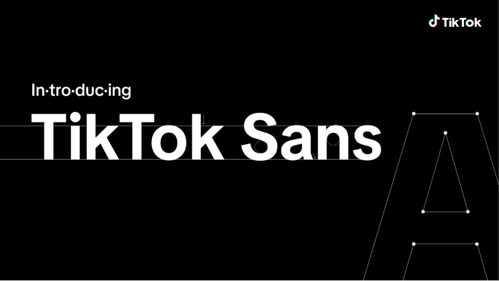
- Spacing: TikTok Sans features larger and more distinct strokes, making individual letters easier to read at a glance.
- Readability: The new font has increased line height and larger lettering, improving legibility on mobile screens. TikTok also implemented a “special formula” to enhance letter spacing for better readability.
- Multi-language Support: TikTok Sans is now available in several languages, including English, Spanish, Portuguese, French, German, Italian, Indonesian, Turkish, and Vietnamese. TikTok also plans to expand this to more languages in the future.
While TikTok Sans is the official font, there are other popular fonts commonly used across videos on the platform. Let’s dive into those next!
#1: Classic
The Classic font, once the default on TikTok, offers a nostalgic touch with its rounded corners and blocky background, reminiscent of the platform’s early days around 2020. Despite being around for a while, it remains a popular choice. If you’re curious about what fonts TikTok use, the Classic font is based on Proxima Nova – Semibold, part of the Proxima Nova family. While it’s free for personal use, a commercial license is required for business purposes.
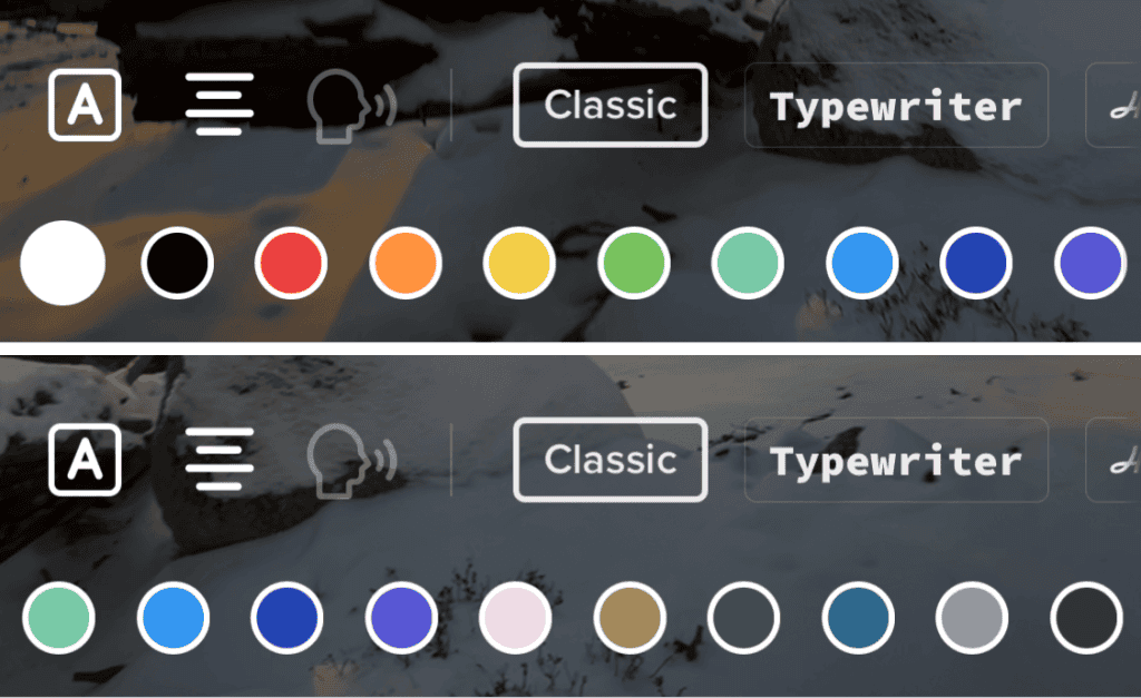
To fully capture the TikTok Classic style, be sure to add a rounded corner text background to your text.
The Classic font is widely used for captions on TikTok and its casual, rounded style suits various types of content, such as funny videos, advice clips, and even keynotes. However, due to its frequent use, many creators are starting to move away from it. While it’s effective for building a following, it might not be the best option for brands aiming to maintain a unique and professional identity.
When to Use:
- Podcast Clips: The casual vibe of the Classic font complements podcast clips, which benefit from clear captions.
- Mini Vlogs: For daily recaps or adventure highlights, the approachable style of Classic helps connect with your audience.
- Standup Comedy: The informal nature of standup comedy works well with fonts like Classic, which are easy to read and don’t take away from the content’s lighthearted tone.
- Skits and Sketches: Similar to standup, skits and sketches can use the Classic font to stay accessible and fun.
When to Avoid:
- Educational Content: Using the Classic font for educational content can make it feel too casual, potentially undermining the authority of your message.
- Luxury Content: For luxury brands, the overuse of the Classic font may make your content appear less exclusive, which could harm its premium image.
#2: Typewriter
Next up, for those who appreciate the vintage charm of hardboiled detectives, classic novelists, and retro aesthetics, TikTok’s Typewriter font is a great choice. This clean, sans-serif font features generous spacing between characters, making it easy to read. It’s a solid option for longer captions or when you want to add a nostalgic touch to your videos.
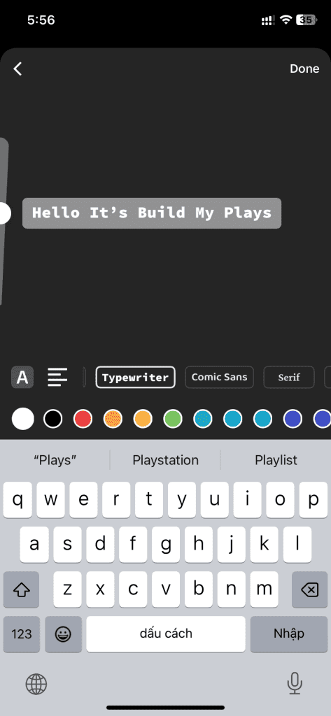
The Typewriter font stands out on TikTok because it mimics the classic typewriter style. This quirky and nostalgic font is especially readable even in multiple lines of text, making it perfect for longer captions.
While Typewriter is often associated with educational content, it can also appeal to a wider audience, including educators, speakers, and advice vloggers.
When to Use:
- Advice: When offering advice, longer captions are often necessary. The Typewriter font works well here, giving the text a more serious and professional feel.
- Monologues: Professional speakers and consultants can use this font to elaborate on their points or subtitle their content, lending a semi-serious tone to their videos.
- Fun Facts: The Typewriter font has just the right amount of casualness for infotainment, making it perfect for fun facts, trivia, and educational content.
When to Avoid:
- Luxury Content: The Typewriter font doesn’t fit well in the luxury niche, where a more refined, mature look is needed.
- Headlines: For headlines, a bolder, more eye-catching font is preferred. The Typewriter font is better suited for body text or captions, as it doesn’t quite fit the style of a headline.
#3: Handwriting
The Handwriting font on TikTok is loved for its aesthetic appeal. However, it can be hard to read, especially at smaller sizes. While it’s not ideal for captioning entire videos, it works well for titles, emphasis, or adding a touch of cottagecore charm. If you’re wondering what fonts does TikTok use for this style, Kaufmann and Cafe Script are similar options. However, neither of them is free. A great royalty-free alternative is the Google font Yesteryear, which mimics TikTok’s Handwriting font in its cursive style.
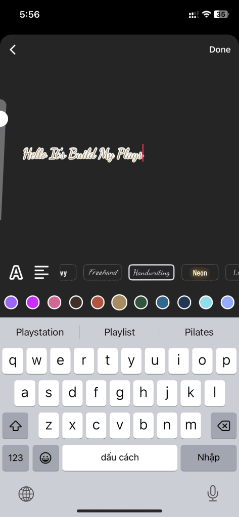
The Handwriting font conveys a creative, quirky vibe. This makes it ideal for artists and content creators. However, it’s not suited for luxury or formal brands. Its casual nature may not align with their tone.
When to Use:
- Video Titles: The Handwriting font is perfect for adding a unique touch to video titles. It helps increase click-through rates by catching viewers’ attention on your profile.
- Creative Labels: Use it for creative labels within videos, such as highlighting a specific project or piece of artwork. It’s great for studio tours or collection showcases.
When to Avoid:
- Captions: The decorative nature of the Handwriting font makes it hard to read, so it’s not suitable for subtitles or captions.
- Formal Content: For formal contexts like legal documents or professional statements, the Handwriting font’s casual style will undermine the seriousness of the content.
#4: Neon
The Neon font on TikTok, characterized by all caps with a glowing background, gives off a bright, vibrant feel similar to actual neon lights. The font has a distinctly geometric structure, even though it features rounded ends on the character lines. A close match to TikTok’s Neon font is Aveny-T, a font that is often used in Meta advertising and on Instagram’s Type font. However, Aveny-T isn’t free to use.
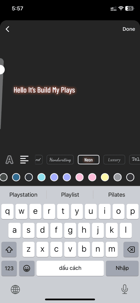
Here’s how to achieve the Neon effect using Abel:
Step 1: Use Caps Lock
Since Neon is always in uppercase, you’ll need to turn on caps lock when using Abel.
Step 2: Add a Glowing Background
Although Abel doesn’t come with a glowing background, you can create the neon glow effect yourself using video editing tools. Start by duplicating the text, color the new text as you wish, and apply a blur effect (about 75%). Then, position the colored text behind the original text to create the glowing look.
Once you’ve completed these steps, your Abel font will closely resemble TikTok’s Neon font.
The Neon font is best used for titles and headlines, especially in festive or celebratory contexts. It fits well with themes related to nightlife, parties, and events. However, it’s a narrow font that may not work for all brands, so it’s important to use it thoughtfully.
When to Use:
- Celebratory and Party Titles: Use it for event announcements, like parties or club openings, where the festive atmosphere takes priority over formality.
- Festive Subject Labels: Ideal for labeling club names, party organizers, or similar themes connected to nightlife and evening events.
- Nightclub Video Titles: The Neon font works great for titles in videos related to the nightlife scene, but avoid using it for subtitles or captions.
When to Avoid:
- Captions: While Neon fits the nightlife theme, it’s not practical for captions or subtitles due to its stylized design.
- Formal Content: Even if you’re promoting a brand related to neon lights, the Neon font should be avoided in formal contexts. It’s simply too casual for corporate or formal content.
Use the Neon font strategically to complement your video’s theme, and always consider whether it aligns with the overall tone of your content.
#5: Serif
Lastly, we have Serif, a font that might not be everyone’s first choice but has still made its way into a few TikTok trends. When used in all caps, it gives a bold and elegant look, similar to a wedding invitation. In lowercase, it evokes the classic feel of traditional printed novels.
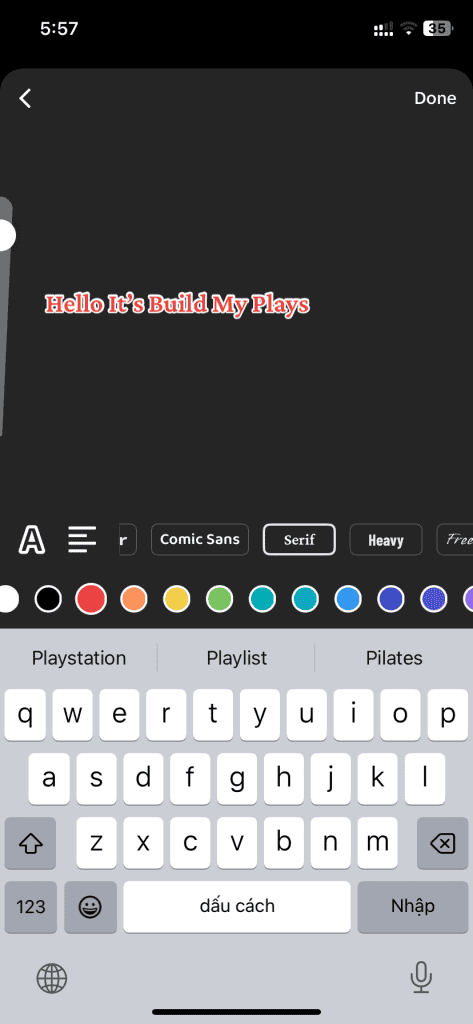
To match the line weight of the TikTok Serif font, be sure to bold the text. This gives the font a more formal, traditional appearance, making it ideal for situations that require a serious tone.
While Serif shares similarities with Times New Roman in terms of legibility, it might feel too formal for casual content, especially in lighthearted videos.
When to Use:
- Educational Videos: The formality of Serif makes it ideal for educational content, where clarity and seriousness are important. It works well for captions in consulting, legal advice, and other educational niches.
- Advice Videos: For advice-based content that requires a serious tone, Serif adds a level of professionalism, especially if the subject matter is more formal or instructive.
When to Avoid:
- Comedy Videos: Comedy thrives on casual, informal vibes, and Serif’s traditional look can feel out of place in this context. It has a textbook feel that doesn’t match the light-hearted nature of comedy.
- Casual Podcast Clips: While podcasts can be educational, they are generally casual. Using the Serif font for captions can create an unnecessarily formal tone, which might turn off casual listeners.
- General Video Titles: The Serif font doesn’t work well for video titles, whether for formal or informal content. Its formal nature doesn’t match the dynamic, attention-grabbing style usually required for headlines.
Final Words
To wrap things up, now that you know what fonts TikTok uses, you can start making more intentional choices with your content. So next time you’re creating on TikTok, take a moment to choose the right font for the vibe you’re going for—it’ll make all the difference!

