YouTube is a competitive battleground for video marketers. So much so, that something as seemingly trivial as your YouTube thumbnail could truly make a big difference in the overall success of your videos.
In this post, we are going to look at all the things you should know about YouTube thumbnails, from the ideal Youtube thumbnails size, through to best practices and examples, and even design tools that could make your thumbnails stand out.
What are YouTube thumbnails?
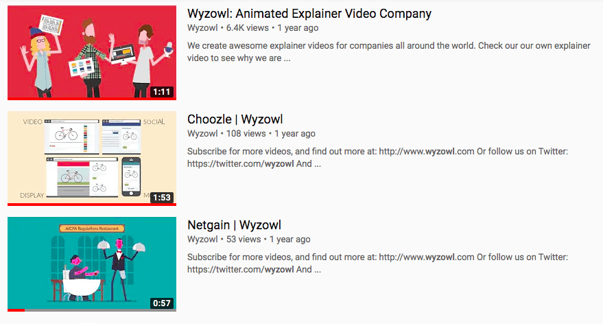
YouTube thumbnails are the preview photos that represent the videos. They provide viewers with a hint of what to expect from the video before they dive into it. Here are some examples:

Thumbnail photos should not be a random still from your video. They need to be carefully chosen to grab the eye of potential viewers.
When people search for a video on YouTube, they are looking for visual content. So although your video will pop up with a title, your channel name, and even the number of views, lots of focus will be on the thumbnail picture – so it needs to stand out!
Ideal YouTube thumbnails size
To ensure that your YouTube thumbnail to have the best impact, it should be the right size. The ideal YouTube thumbnails sizes are as follows:
- Resolution: 1280×720 (with a minimum width of 640 pixels)
- Aspect Ratio: 16:9
- Max File Size: 2MB
The accepted picture formats are GIF, JPG, and PNG.
How to add a custom thumbnail
If you add a video to YouTube, the platform will automatically generate three thumbnails for you. These are chosen at random from the video content and will appear at the bottom of the upload page:

As you can see, these are just stills chosen from the video. And none of them actually stand out. To add a custom thumbnail after knowing Youtube thumbnails size, click on the customized thumbnail button and add your picture. Then click on the save changes button, and you are finished!
Best practices
In an arena as competitive as YouTube, it isn’t enough to easily know how to do something. You should know how to do it well.
Here are 7 best practices for making a YouTube thumbnail…
1. Grab attention with text overlays
Including text to your thumbnail may help to attract viewers in and give them a quick insight into what the video is going to be about. That is particularly useful if you wish to add more context than you did in the title. Here’s an instance:

‘Fake duck kidney’ is not exactly a good keyword to include in your video title! However, including it in the thumbnail could spark curiosity and inspire users to click and watch.
2. Make it relevant
Nobody likes clickbait. So make sure that your thumbnails reflect what truly occurs in your videos.
By giving potential viewers a hint of what they’ll see in the video – just like the thumbnail below – you can’t only encourage them to click, but also guarantee they will not be disappointed by what they see.

3. Include your logo
By adding your logo in your thumbnail you could strengthen your brand presence and also enhance your chances of viewers remembering your brand name. This won’t only come in handy once they wish to search for you on YouTube, however, it can also assist you to generate some word of mouth marketing if they tell their friends.
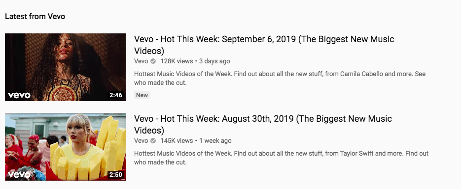
Instead of plastering your logo over the main picture, place your logo in a discreet place, and keep the placement consistent. Vevo always adds their logo in the bottom left corner:

It does not detract from the main picture at all, however, it makes instantly clear that Vevo uploaded and owns the video.
4. Less is more
YouTube thumbnails are quite small, so it’s essential that you don’t overcrowd your thumbnails. This might sound contradictory, particularly once we are also advising you to add your logo and text overlays, however, there is a vital balance to strike.
If there is too much occurring on-screen, then your thumbnail can truly turn people away instead of drawing them in. And that is the opposite of what you want!
5. Make people curious
Your thumbnail is the main selling point of your video. It’s usually the difference between people watching your video or watching another (probably made by a competitor).
In case your thumbnails make people curious, they will get more chances to be clicked on the video. You could spark curiosity with action pictures, like this:

Or, if there are not any fascinating action pictures in your video, you could make a thumbnail with graphics that’ll pique the interest of potential viewers:

6. Test! Test! Test!
In terms of making a Youtube thumbnail, the chances are almost limitless. There’s only one method to find out what works and what doesn’t, and that’s to get testing.
To find out what your viewers reply to, swap out your thumbnails every couple of weeks and measure the difference in views. You might discover that you get more views on a video with text in the thumbnail, however, why stop there? You can tweak the size of the text, the font, the color, etc!
There’s no right or wrong factor to do here. It’s all about testing and finding out what your viewers prefer.
7. Be consistent
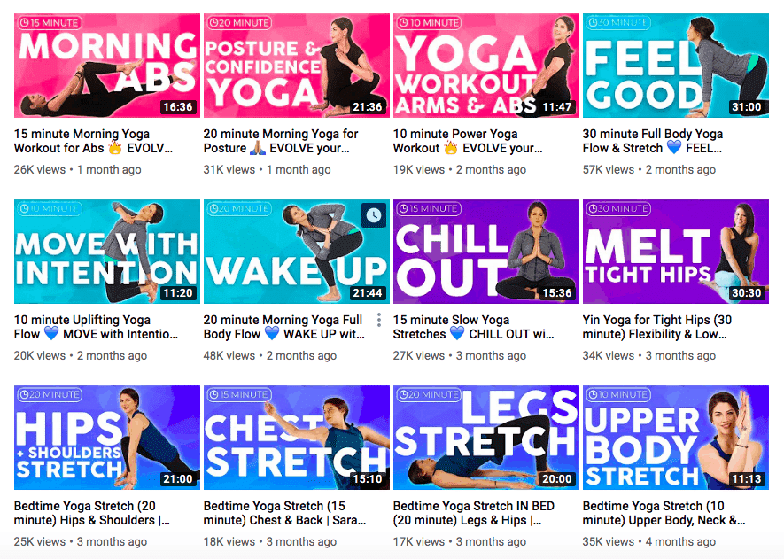
Consistency will assist viewers to determine your videos among the masses of outcomes on their YouTube homepage or search outcomes screen. And it’ll also assist to strengthen your brand presence on the platform. Check out this instance:

That is a particularly great idea when you have already tested your thumbnails and know what works best for your channel.

