You put a lot of work into making great ads on Instagram: selecting the format, choosing your photos, writing an awesome caption, and including a compelling call to action. Getting that click is only half the battle. Your visitor has not taken you up on your offer yet—whether that is making an order, downloading your app, or subscribing to your newsletter. Having superb Instagram landing pages on the other side of that ad is the key to turning clicks into conversions.
Your ad is the hook, and the Instagram landing page is the sales pitch. Make it one that is compelling, direct, and irresistible. Find out the formula for an amazing Instagram landing page below!
8 Secrets to Creating Great Instagram Landing Pages for Instagram Ads
1. Make it scannable
In this hyperactive digital age, our attention spans are only about 8 seconds long. When you do not convey your meaning rapidly, you will lose your viewers.
To do this, you should make the text on your landing page simple to skim and understand. Do not make your customer hunt for the meaning—it should be clear and easy.
Opt for short chunks of text or bullet points over long paragraphs. If you could use an infographic or a statistic to convey a point more effectively, do it!
2. Keep it focused
Your landing page is not just another version of your homepage. It is not a Cheesecake Factory menu with 250 items, it is a signature dish. You want it to do one thing really well, so keep your eye on the goal.
Everything on your landing page should direct the visitor to your call to action (CTA). It should be simple to see at first glance what the point of the landing page is, and what action somebody should take once they are there.
Ensure your CTA stands out, and put some thought into crafting it. Do not distract customers with other links or options which may take them away from the task at hand.
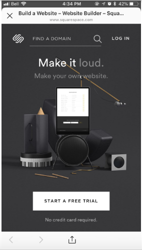
This landing page from Squarespace is a prime example. The graphics make it visually appealing, however, the text is clean and minimal, with a CTA button that stands out. It is clear to the customer what the next step of their journey should be.
When you need or want to add more content to your landing page, like testimonials or function details, keep the most important text above the fold.
Having some white space (or, in this Squarespace example, black space) looks good and directs the customer’s eye. Using arrows, bullet points, or other visual cues could help too.
If you want to ask your visitor to fill out a subscription form or share their contact info before downloading your ebook or app, stick to the essentials and keep away from including too many fields for a higher conversion rate. Visitors coming from Instagram will be on mobile, which is not ideal for filling out long forms.
3. Show social proof
There is a reason you check Yelp before selecting a restaurant (or the analog method: selecting a place with a lot of happy-looking eaters inside). Likewise, there is a purpose you do not purchase products that have one-star ratings and bad reviews on Amazon. Social proof is essential to decision-making because, generally speaking, if lots of people like something, then it is probably good.
Social proof can come in many forms:
- A glowing testimonial from an influencer
- Logos from firms that are using your service
- Ratings from users
- Number of users, downloads, or subscribers
- And more!
When it comes to testimonials, share authentic, particular details from real people about why your services or products are special. This adds credibility and assures potential customers of your product’s worth.
Keep in mind: because you have limited space on your landing page, select the best examples that reinforce your offer.
4. Make the value clear
Do not get so caught up in persuading your viewers what to do this you forget to persuade them why to do it. Communicate the value of your offer.
Often, an Instagram ad only provides enough characters to hint at the offer. On your landing page, you have the chance to flesh it out. Why should your customer take action now? Why should they select you over a competitor? What makes this chance special?
Tangerine Bank’s landing makes it simple to spot the value.
When explaining the value of your offer, provide particular examples. Do not say that your services or products are “the best” or “better than the competitors.” Vague and overblown statements are forgettable.
When you force customers to search for the details they want, you risk losing their interest (keep in mind: we have brief attention spans!). Instead, share what sets you apart from your opponents in concrete terms.
5. Message matching is key
Message matching is exactly what it sounds like ensuring your messages (in this case, on your Instagram ad and your landing page) are perfectly aligned.
This sounds intuitive, however often clicking on an ad takes you to a landing page on a totally different topic. Or the messaging is slightly different, contradicting the reason you clicked on the ad in the first place. When you saw a sign saying “FREE ICE CREAM!” outside an ice cream shop, and then inside you found that the ice cream was only free with a $20 purchase, you’d be rightly annoyed.
This type of bait-and-switch is confusing and frustrating to customers. When you advertise a free app however take somebody to a landing page about a paid version, they are not going to stick around.
Reiterating the exact wording of your ad copy on your landing page is usually a good idea because it proves that the customer is in the right place.
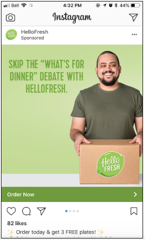
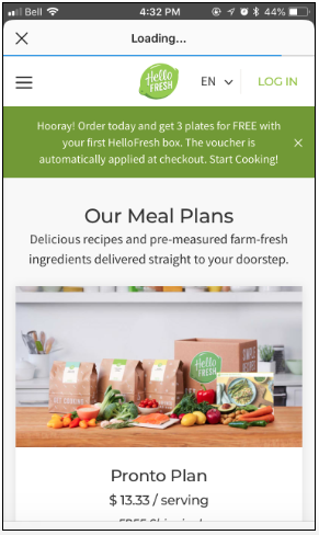
HelloFresh, a meal-planning service, does this well on its landing page. The Instagram ad promises a particular offer of 3 free plates. This similar offer is echoed at the top of the landing page, delivering on that promise.
As in this example, message matching not only prevents confusion however it also builds trust.
6. Create a seamless visual experience
Maybe you have heard that 60 % of top brands on Instagram use the same filter for every single post. That is because visual consistency is essential for your brand identity, and for creating a pleasing browsing experience.
The look and feel of your Instagram landing pages should align with your Instagram ad and your site. Use pictures and fonts which are similar to the ones in your ads. This type of continuity increases the likelihood of a purchase.
When you have ever been in a beautiful boutique that had terrible changing rooms, you know how much that jarring transition could affect your experience. Do not let your Instagram landing pages be the unflattering changing room of your brand!
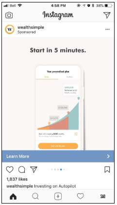
Wealthsimple, an investment management service, transitions smoothly to its Instagram landing pages. Discover the way it reflects the colors, graphic shapes, and fonts of its Instagram ads.
7. Use different Instagram landing pages for different ads
Now that you know the way essential message matching and consistent visuals are for successful Instagram landing pages, you could understand why you need to be updating your landing page for each ad.
That does not mean you should reinvent the wheel each time. You could simply update the text of the landing page to mirror the headline on your Instagram ad or replace the picture to match the ad.
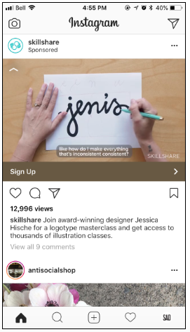
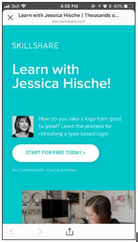
For example, Skillshare created Instagram ads showcasing each of its different courses. An ad that includes logotype designer Jessica Hische that invites customers to sign up for Skillshare leads to Instagram landing pages that feature Jessica’s course.
8. Experiment for improvement
Similar to you need to always test your Instagram ads, you should also test how different elements perform on your Instagram landing pages. A/B test two versions of a landing page with the same ad or tweak your Instagram landing pages frequently and see what performs greatest.
Attempt different CTAs to see what leads to more conversions. Experiment including different pictures, or rearranging the elements on your landing page. See which influencer testimonial has the best impact. Get creative – you could be surprised by what works best!
As with any other experiment, these sorts of tests will help you refine your strategy and get to know your customers. You will achieve a better understanding of who your viewers are, and what they are looking for from you.


