The swift evolution of social media has rendered its icons ubiquitous in daily life. Integrating social media icons into your brand’s marketing strategy presents invaluable opportunities, whether on your website, blog, emails, or marketing collateral. However, these icons are legally protected trademarks of the respective companies. Exercise caution and adhere to brand guidelines to avert potential legal ramifications before incorporating these logos. Given the dynamic nature of social networks, regularly updating their design and features, and staying informed about these changes is crucial. Brands must stay abreast of these alterations to ensure social media logos and icons are used correctly. This comprehensive blog offers insights into the latest social media icon and essential usage guidelines. Delve into the details to acquire a profound understanding of seamlessly incorporating these icons into your marketing strategy, safeguarding your business from legal repercussions.
Utilizing Social Media Icon in Brand Marketing
Ever wondered why those little social media icon matter? Well, they make it easier for people to find and connect with your business online. You’ve probably seen them on websites, social media graphics, or even in ads. Here’s why they’re essential:
- Easy Discovery: Icons help your audience discover your business on different social channels, like Facebook or Twitter. It’s a quick way for them to know where you are.
- Connect Effortlessly: People can click on these icons to connect with your business. For example, on our homepage, you can click the icons to visit our social media pages.
- Neat and Uniform Look: Using these icons makes your website look tidy and organized. Visitors already know what happens when they click on a specific icon, so you don’t have to bug them with pop-ups asking them to follow you.
- More Content Sharing: Icons encourage visitors to share your content with just a few clicks. It’s way easier than copying and pasting URLs. You can see this in action on our blogs where you can share content on social media directly.
- Visibility Boost: Adding these icons to your emails or newsletters helps people find and follow your brand. Even in print materials like business cards or brochures, they help reinforce your brand presence.
- Clean Design: Icons reduce text, making your design look attractive and less cluttered. But remember, in print, you need to add details like usernames since you can’t click on them.
So, next time you see those little icons, remember they’re not just for show – they’re making your online experience smoother!
Social Media Icon Guidelines
Remember, social media icons are like special logos owned by the companies. So, if you want to use them, there are some rules you should follow. Let’s look at the rules for using Facebook icons
Facebook Icon Guidelines
You’ve probably seen the small “f” logo for Facebook. It’s known worldwide and represents Facebook and its app called Meta. If you want to show that your brand is on Facebook, you can use this ‘f’ logo.
- When you use the ‘”f” logo, it’s important to use the right colors, either blue or white. If you can’t use these colors, it’s okay to use black and white. But don’t change the colors, design, or size of the ‘f’ logo.
- Make sure the “f” logo is the same size as other logos nearby, and keep its shape the same. Leave some clear space around it when you put it with other logos.
- Don’t make the “f” logo move or change it in any way. If you use it online, use certain color codes. If you use it in print, you can use different color codes.
Important: If you want to use the Facebook logo for things like TV ads or print ads, you need to show it to the Facebook team before you start.
If you work with Facebook or are sponsored by them, you can talk directly to Facebook to get permission and advice. When you advertise on Facebook, you must follow their advertising rules.
Instagram Icon Guidelines
To use the Instagram icon correctly, go to the Instagram Brand Resource Center and download the approved icon from there. Stick to these rules when using Instagram icons:
Rules for Instagram Logo
Get the Instagram icon only from the Instagram Brand Resource Center. There, you’ll find different versions in colors or black and white.
- Use the black and white Instagram logo when talking about your presence on Instagram. The colorful icon is called the ‘App Icon.’ Use it only when showing it on a device with other apps or encouraging people to download the Instagram app.
- Don’t change the colorful camera logo. Instagram lets you use the black-and-white logo in any solid color, but everything else must stay the same. Keep the size at least 29X29 pixels.
- Ask for permission if you plan to use the icons on TV, radio, print, or big ads. Your request, in English, should include a sample of how you’ll use the icon.
- Don’t write “I” in Instagram with a big letter or change its font. Don’t use abbreviations, translate Instagram, or add non-English characters. Don’t mix “Insta” or “gram” with your brand.
Important: Never mix Instagram with a company name, other trademarks, or common words. Even in scripts, don’t make Instagram look bad. Follow Instagram’s rules and guidelines.
You can mention Instagram in a TV ad with Facebook or other Facebook companies. But add a clear message like “Follow us on Instagram” unless it’s in a list of other social networks.
X (Twitter) Icon Guidelines
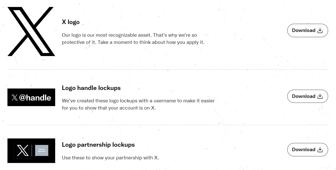
When using X icons, follow the X Brand Guidelines. Get the approved logo from X Brand Resources, and read the guidelines carefully. X is very protective of its logo, so be sure to use it correctly.
Rules for X (Twitter) Logo
- Don’t change the logo’s shape or form, like rotating or adding things to it.
- When putting the logo on a picture, use the white version. If your picture has a light background, you can add a bit of black (10-20%).
- If you want to use colors differently, ask X for permission. And don’t make the logo too big.
Important: Don’t make the logo move or look like a person or animal. Don’t put other creatures or birds around it. Always use the latest logo version. X says the logo should be 16 pixels, and leave some space around it (150%).
Remember: Don’t add special effects, and don’t use other marks that make it seem like X sponsors or endorses something. And never use old logos or things that can mix up X with another brand.
YouTube Icon Guidelines
You can get the YouTube icon from the YouTube Brand Resources page. Follow these YouTube guidelines to avoid legal issues.
Rules for YouTube Logo
- Leave space around the YouTube logo, at least the size of the triangle. This space makes the logo look better.
- Whether you use the logo online or in print, make sure it’s clear. For digital, the logo’s minimum height is 20 pixels, and for print, it’s 0.125 inches or 3.1 mm.
- Don’t change the YouTube logo. Keep the spacing, typeface, shape, and effects the same.
- The YouTube logo has two color options. In full color, it’s red with white or almost black text. In monochrome, the icon matches the text color, either almost black or white. The triangle in the monochrome logo should be see-through.
- Only use red, white, and almost black colors. Don’t put the logo in a sentence.
- YouTube should only link to a YouTube channel.
Important: You need special approval to use any YouTube brand elements. Fill out the Brand Use Request Form in English for review before use.

