
Continue to find out why Facebook alt text is important.
If you’re involved in social media, you’re probably aware of the increasing importance of digital accessibility and inclusivity. One key aspect of accessible content is adding alt text to images. By including Facebook alt text in your posts, you can improve the accessibility and discoverability of your content. If you’re new to alt text, don’t worry! In this article, we’ll show you how and why to add alt text to your Facebook posts. We’ll also provide some examples of effective alt text that you can use as inspiration.
Tips to Write Great Alt Text
Writing alt text for Facebook requires some skill, but it can make your content accessible to a wider audience. To ensure you write effective alt text, here are some best practices you should follow:
- Describe the content of the image
- Consider the context
- Use keywords sparingly
- Keep the text clear
- Avoid filler words and emojis
- Review for typos
Now, let’s dive deeper into each of these practices and explore some great examples of alt text done right.
Describe the content of the image
When adding alt text to your Facebook posts, your goal should be to accurately describe the image’s content. To achieve this, it’s important to use specific and descriptive language rather than something too generic.

For instance, take the alt text used by home goods brand Brooklinen on an image that shows a dog sitting on a queen bed with their sheets and duvet comforters in dusk blue, sienna, and macadamia tan. A more generic alt text could have simply said “dog sitting on a bed,” but Brooklinen’s description is much more detailed and relevant to their brand.
You can use this example as a formula for writing great alt text. Your descriptions should contain a subject, a verb, and one or two descriptors that provide a complete picture of what’s happening in the image and make your brand stand out.
Consider the context
Another important factor to keep in mind while writing alt text is to consider the context of the image. Think about what details someone who cannot see the image might need to better understand the post’s content.
For instance, if the image is being used to demonstrate a particular point or idea, such as a chart or graph, including the text in the alt tag could be useful for users who use screen readers.
The New York Public Library offers a great example of this in their Facebook post that put a spin on the Spotify Wrapped campaign. They used the alt description, “Parody of Spotify Wrapped graphic reads…” and then listed the made-up books featured in the image to provide more context.
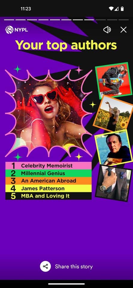
If they had used a less descriptive alt tag, such as “a graphic with books,” it would not have been as helpful. NYPL’s version offers the necessary context that all users need to make the cultural connection to the graphic.
Use keywords sparingly
Let’s talk about using keywords in alt text for Facebook. While it’s true that they can help your images get discovered, you don’t want to overdo it. The most important thing is to accurately describe the image, so don’t sacrifice accuracy for the sake of keyword optimization.
When you stuff too many keywords into your alt text, it can sound unnatural and be jarring to read for users relying on screen readers. Starbucks does a great job of incorporating relevant keywords in a natural way in this example, where the alt description reads: “A cold brew sits atop a layer of pistachios—half shelled, half unshelled—split down the middle diagonally.”
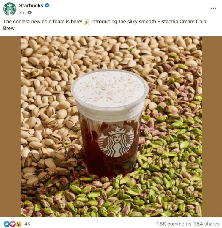
By starting with the popular search term “cold brew” and then including a detailed description of the image, Starbucks has created a seamless alt text. If you need to include a keyword that doesn’t fit naturally, try using a semantic keyword that makes more sense in context.
Keep the text clear
It’s important to keep your alt text clear and to the point. While there isn’t a character limit for alt tags, some screen readers will stop reading after 125 characters. To make sure your description gets read, it’s best to keep it short and sweet.
Long alt text can be confusing and disrupt the flow when being read by a screen reader. To keep your audience engaged, make sure your alt text is brief and doesn’t repeat what was already said in the caption.
For example, check out the alt text on this post from Princeton University: “Tree with orange, red, and yellow leaves behind a bike rack on Princeton’s campus.” This description is specific, descriptive, yet succinct. It doesn’t include any unnecessary keywords or filler words.

Another reason to keep alt text concise is that when an image doesn’t load, the browser will display the alt text in its place. So, make sure your alt text fits within that visual space and doesn’t overload the user with too much text and information.
Avoid filler words and emojis
When crafting concise alt text descriptions, there are a few words and phrases you should avoid. For instance, there’s no need to use phrases like “image of” or “picture of” since screen readers will provide that information. Additionally, when you’re working with a limited character count, it’s important to use that space wisely by choosing specific descriptors and avoiding filler words.
It’s also best to skip the emojis, as they can disrupt the flow of your description and may not be accurately translated by screen readers. To ensure a smooth user experience, stick to clear and straightforward language in your alt tags.
Review for typos
Have you ever hastily written a Facebook caption without checking for typos or mistakes before posting? Probably not. Similarly, you shouldn’t treat alt text as an afterthought. Give the same attention and care to crafting your alt text descriptions as you do for your Facebook captions. This means planning ahead and reviewing your work for grammar errors and typos before publishing.
To ensure your alt text is accurate, read it out loud after crafting and reviewing it. Doing so will help you catch any mistakes you may have missed and ensure that the text flows naturally. Remember, taking the time to review your alt text can make all the difference in creating an optimal user experience.