Welcome to part two of our article on creating an amazing Facebook cover photo. In part one, we discussed the size and how to have a visually appealing cover photo by using Canva. In this section, we’ll continue to guide you through creating a captivating Facebook cover photo. You’ll learn many different design tools and techniques. By the end, you’ll have the skills to create a cover photo that grabs attention and sets your business apart. So, let’s dive in and get started!
Facebook cover photo templates for free
Our pre-made templates can simplify the process of creating an amazing Facebook cover photo. No need to browse through Canva templates. To customize the templates for your brand, you’ll require Adobe Photoshop.
1. You’ll notice that the fonts and image files are separate after you download the templates. To install the font, double-click on the font file for your chosen theme. Click the Install font button.
2. Double-click the photo file to open it in Photoshop.
3. Choose the Facebook cover photo template you want to use first.
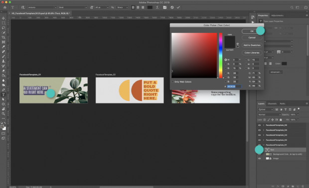
4. To modify text: Double-click on the text you want to change. Alter fonts and colors in the left menu.
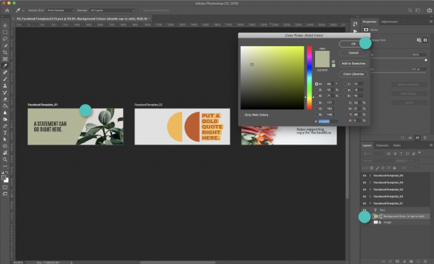
5. To change the color of a color block or background, double-click it. Change the size or color by using the menu on the left.
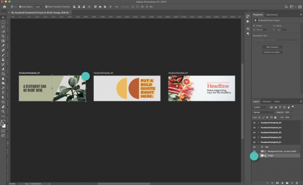
6. To edit a photo or image, first, double-click it and then select Insert New Image. Resize the image as needed.
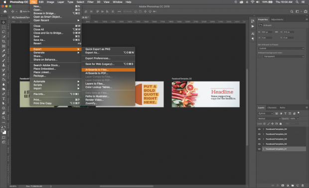
7. In order to save the template, follow these steps: Choose the template you want to use and then go to Save>Export As>Artboard to Files. Make sure to save the file as a.jpg or.png.
8. Use the steps below to upload your Facebook cover photo.
How to Upload Cover Photos to Facebook
Once you’ve completed your Facebook cover photo, uploading it is simple.
- Firstly, go to your Facebook business page and hover your mouse over the top cover photo space.
- Then, in the top left corner, click Add a Cover.
- Next, Select the photo you want to upload by clicking Upload Photo/Video.
- In the cover space, a preview of your photo will appear. Drag the photo up or down to the vertical orientation that you prefer.
- Finally, press the Publish button.
If unsatisfied with your Facebook cover photo’s position, click Update Cover, then Reposition to return to step 4.
You can accumulate a library of cover photos as you upload more. If you wish to switch your current cover photo with an older one, choose Select Photo instead of Upload Cover Photo in step 3 and you’ll be able to pick from previously uploaded images.
Best practices for Facebook cover photos
There is a correct and incorrect approach to creating your Facebook cover photo. Here are some guidelines you can adhere to, to guarantee you are on the path to success.
Use a straightforward image with a distinct focal point
Your cover photo should not be too busy or cluttered. Opt for a simple image with minimal distractions to avoid diverting attention away from your page.
Having a clear focal point means having a natural spot where the viewer’s eye is drawn. In the example shown below, the woman with the cucumber is the focal point.
Follow the cover photo guidelines on Facebook
It’s always a good idea to follow Facebook’s cover photo guidelines. Check their list on a regular basis, as Facebook’s policies can change at any time.
Make sure your cover photo adheres to Facebook’s business guidelines as well. Copyright, for example, cannot be violated.
Align objects to the right
By right-aligning the elements or objects in your cover photo, you guide the viewer’s gaze in a left-to-right direction, towards your page’s call-to-action (CTA), increasing the chances of engagement.
Left- or center-align text
When adding text to your Facebook cover photo, position it at the top left or center to follow the natural reading pattern from left to right. This will draw the viewer’s eye toward your call-to-action (CTA) at the end. The Adidas example centers the text with a right-aligned green focus, guiding the eye toward the Shop on Website CTA.
Match your Facebook cover photo to your profile picture
A matching Facebook cover photo to your profile photo always appears professional and well-presented. Take advantage of this opportunity to experiment with your brand!
Make your cover photo mobile-friendly
When selecting an image for your Facebook cover photo, consider how it will appear on smartphone screens. Mobile users account for roughly half of all web traffic globally. Think about how your image will appear on different devices.
Take into account the following:
- Is the text understandable?
- What about the finer details on a smaller screen?
- When your cover photo is resized to mobile format, what is cut off?
Include a link in your cover photo
Adding a link in the caption of your Facebook cover photo is an effective strategy to increase traffic. You can even use it as an opportunity to surprise your viewers with an Easter egg, such as directing them to an exclusive product or prize. As with all social links, use a link shortener to make your URL shorter.
Use your cover image to promote your campaign
As your cover photo is situated above the fold, it provides a prime opportunity to communicate your key message to your audience immediately.
Have an upcoming sale, giveaway, or product launch to promote? You can leverage your cover photo to showcase a promotional image and get the word out.
With approximately 2.91 billion monthly active users on Facebook, the potential audience for your promotional materials is vast.
Avoid using pixelated images!
If you upload a large file to your cover photo, Facebook will attempt to compress it. As a result, your cover photo may become pixelated and appear low-quality.
To avoid this, make sure your file is as small as possible. Facebook suggests 100kb or less.
Experiment
Try experimenting with different Facebook cover photos to see what resonates with your audience. Testing is crucial to understanding which visuals work best on social media.
Conduct A/B testing to determine which cover photo catches your viewer’s attention and prompts them to follow your page. Track any increase in followers or engagement with the photo and create more content similar to that. It’s a cycle of success.
Maybe your audience will respond positively to a bright, minimalistic design, like the one shown below:
or perhaps they prefer a geometric collage in neutral tones:
Experimenting with your amazing cover photo may be one way to increase your Facebook likes. It may also aid in increasing your Facebook engagement. You don’t know unless you try.


