While Facebook cover photo size doesn’t seem like a big deal, it is. Like everything your brand produces online, anything less than an optimized presence can hurt your chances with ideal customers. Conversely, the right design and dimensions will do wonders for your brand. The perfect Facebook cover photo will give your company a professional look and feel. They also inspire confidence, credibility, and make your brand feel altogether approachable and likable.
While there’s no secret to Facebook cover photo sizes, something this guide definitely includes. Facebook cover photo size is a part of an important topic: Design. And design can be complex. You need to balance the right elements in your Facebook cover photo to ensure that you strike the right chord with social media visitors.
Facebook cover photo sizes
For desktop, the size of Facebook cover photo is 820 pixels wide and 312 pixels tall. On mobile, your image will appear as a 640 pixels wide by 360 pixels tall graphic. As you can imagine, if your desktop image is imperfectly optimized according to Facebook cover size requirements, mobile users will see anything but a professional-looking image.
While the above are the perfect Facebook cover size dimensions, the social media giant also offers minimum requirements to allow you to present the best possible Facebook cover photo. Minimum requirements include a size of 400 pixels by 150 pixels and that you use sRGB JPG files that are less than 100 kB in size
Facebook also recommends the use of PNG file types for Facebook cover photos that include images with a logo or text. This is due to automatic compression Facebook performs for cover photos. You’ll also find that the colors you opt for may not render clearly due to compression. Our recommendation is to lean away from Facebook cover photos with large areas featuring bright colors.
How to Create an Amazing Facebook Cover Photo
Creating the perfect Facebook cover photo requires a little more than resizing a stock image copy. In fact, your Facebook cover photo has more to do with your ideal buyer. And you have decide what they want than an image that speaks to you. To get your brand look attractive in front of your audience, you have to create something that speaks to their needs. They’re what people look for in a company when searching for a solution like yours.
To help, we’ve created a quick guide with basic but powerful concepts that you can use to create your Facebook cover photo. You’ll find these invaluable as they are based on timeless marketing and design fundamentals, giving you all you need to make an impact with your audience.
What Does Your Business Stand for?
Sure, it may sound like a loaded question, but it’s a biggie. Buyers are drawn to brands that share similar values. And when it comes to attracting your ideal customers, if you can draw a clear line of association between what your brand has to offer as a product, the values it lives by, and how both perfectly fit into the world of your buyer, you’re onto something.
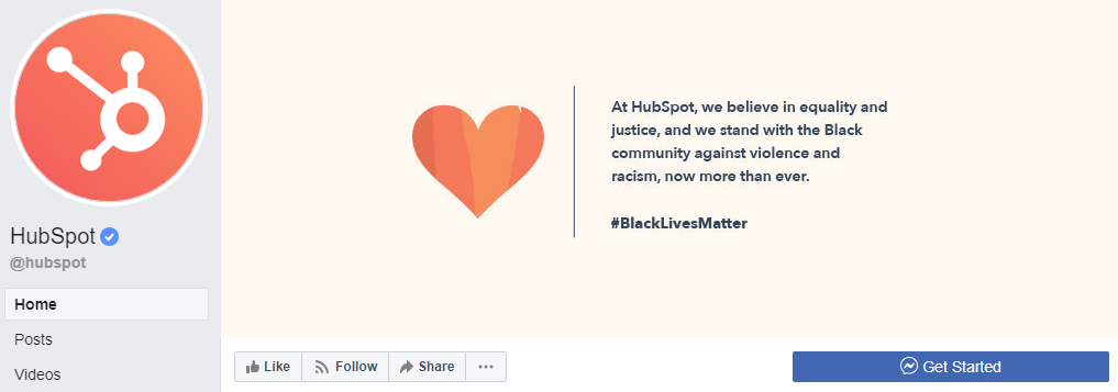
Take HubSpot’s cover photo. It was published in a time when the world was jolted by racial violence and racism. HubSpot took a bold step in aligned itself with values showing that it has a heart and believes in equality.

