We continue to find out more knowledge about size and design of Facebook cover photo.
Make Your Colors Stand out
There’s nothing more appealing than seeing branding done well. People are drawn to beautiful design, and color is a major part of creating attractive Facebook cover photos. To make your colors stand out, use color contrast.
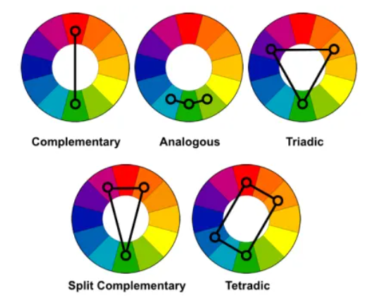
Here are five color contrast options you can apply to your Facebook cover photo design:
- Complementary colors: colors at opposite ends of the color spectrum
- Split complementary colors: one color matched with two adjacent complementary colors
- Analogous colors: three colors alongside each other
- Triad colors: three colors equally apart
- Tetradic or double complementary colors: four colors equally apart
Image: Life Hacker
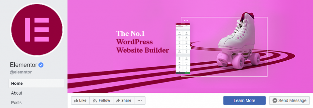
Elementor shows how to analogous color and a splash of white to make their cover photo pop.
Showcase Your Product
While Facebook cover photos represent your brand, they don’t have to be dull. You can spice things up by sharing a campaign or promoting your product. And we recommend that you do. Facebook cover photos offer a considerable amount of free real estate. You can use it for powerful messaging about your products, giving buyers a closer look at why your brand may be the best choice.
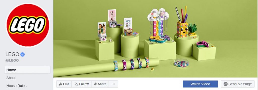
Lego is an awesome example. The building blocks brand uses its Facebook cover photo to showcase its new range of stationery and dress wear products. And if your Lego fan looking for something fun, seeing this Facebook cover image will immediately get you excited about what they have to offer.
Inspire Your Audience
Creating a perfect brand is all about appealing to your audience’s aspirations. For your product to be successful, it needs to be positioned in opposition to the pain point of challenge that your target market experiences. Which is why the best branding helps buyers want to do and be more.
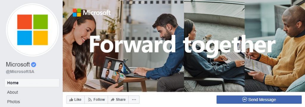
Microsoft’s Facebook cover photo is inspirational. In just two words, you need to get the sense that the tech giant wants to empower you to reach your full potential. How? By becoming your technology partner. What Microsoft has done is connected to big and important aspects of modern living. First, the need for every human being to experience self-actualization. Second, the importance of technology and how it drives progress.
And this is the kind of powerful messaging that’s led to Microsoft’s success. Once you become a Microsoft operating system user, making the switch to Linux or Mac isn’t necessarily something you do willingly. In fact, even if you were to switch over to these competitive brands, there’s a good chance you’ll still want to use Office because you’re used to it and it just makes sense.
Use Video
While Facebook released Facebook cover videos in 2018, you wouldn’t be wrong for thinking that very few brands took to the new medium. Truth is, most brands still struggle with the concept of video and integrating it into a larger content marketing strategy. Video seems bulky, complex, and the thought of creating something unique for your Facebook cover photo may seem like a stretch.
But don’t miss out on the opportunity to use Facebook cover videos. Video is powerful. More marketers are using it today. Research by Wyzowl shows that 85% of businesses use video as a marketing tool. What’s more, 92% say it’s an important component of their marketing strategy. And with the amount of space Facebook graciously makes available, you’re able to really get your brand out there.
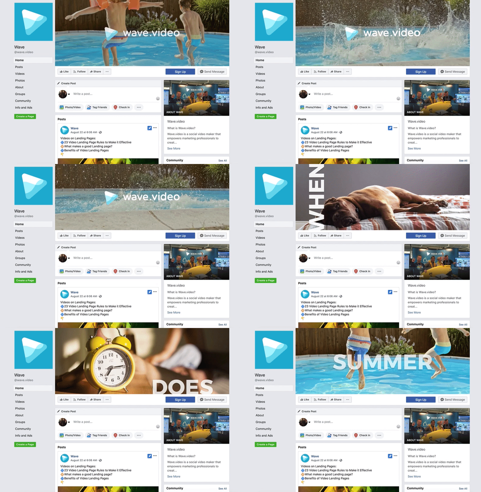
Take this example from wave.video. In it, they show what their video creation tool is capable of. And if you’ve been paying attention, you can see exactly how attractive moving images are, another great reason to give video a go.
Facebook cover video specifications are similar to standard Facebook will cover damages. Your video must be at least age 820 pixels by 460 pixels but you can get away with a minimum resolution of 820 pixels by 312 pixels. While it may seem counterintuitive given our advice following Facebook’s recommendations, when it comes to Facebook cover videos, you may want to push the boundaries.
Great video is all about quality.
The sharper your image, the better. To get the best look and feel for your video, stock video site Gallereplay recommends extending your dimensions to 1280 pixels by 720 pixels. Video file formats must be in MP4 with videos formatted in landscape and a 16:9 ratio. While Facebook cover videos are attractive, don’t be alarmed when you upload yours. It doesn’t play with sound upon visiting your page. This is a default setting enforced by Facebook. We believe it’s got to do with how people consume online content. According to Digiday, as much as 85% of people on Facebook watch videos without sound. It just seems more palatable.
As with Facebook cover photos, apply the same tips from above. Share what your brand stands for, showcase your product, and aim to inspire your audience. Remember, your audience is in the market for a solution. They want to find and use products and services that add value to their lives. If your video can communicate a direct benefit and engage with them on a personal level, the one step closer to winning a new customer.
Conclusion
Facebook cover photos are must-have for all brands. Given the prominence of social media and how important a medium it is for the discovery of new products and services, you can’t risk the opportunity of not positioning your brand competitively. But to do so, you have to create a quality Facebook cover photo or video, one that resonates with your audience. Take the time to establish which core values you’d like to communicate, products and services that you can showcase, and how you’d like to inspire your buyers to reach their full potential.


