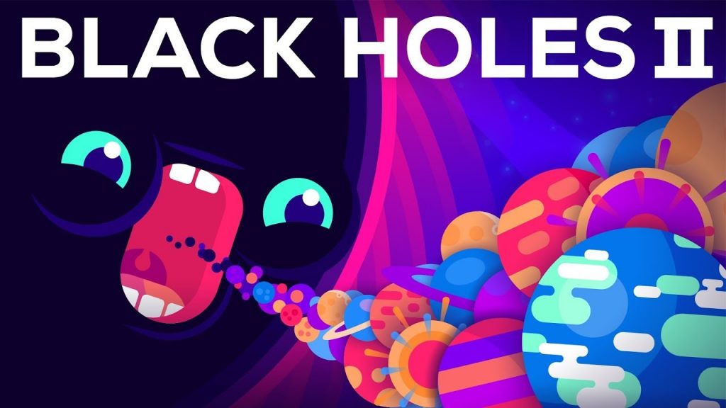
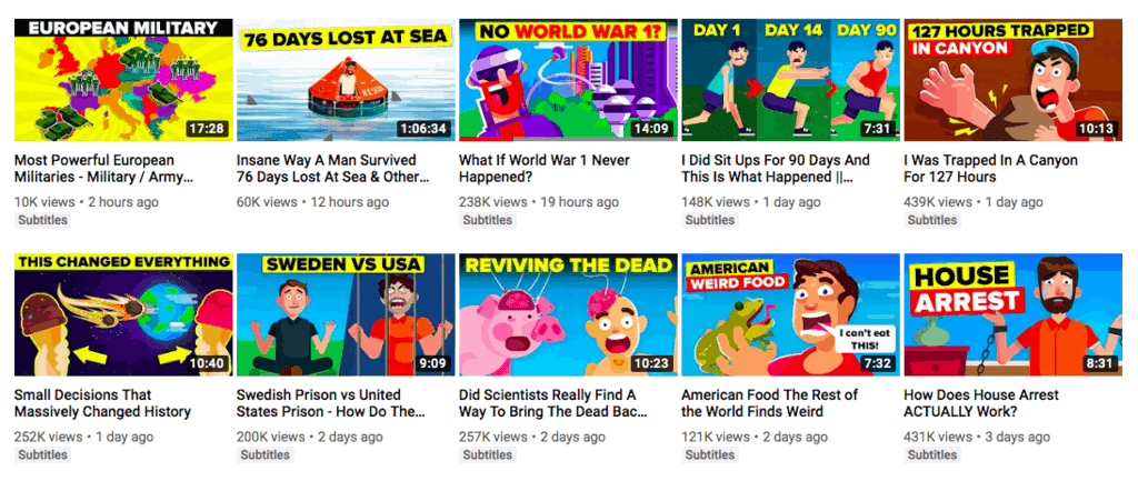
Keep reading to know more ideas with YouTube thumbnail that will help you get more clicks and audiences.
9. Use your YouTube thumbnail to explicitly say what your video is about
Although it sounds obvious, do not use images which are not related to the video content for your thumbnails.
This doesn’t make you look good. Viewers want to watch videos that can satisfy whatever their needs are in that moment. Whether they want to be entertained, informed, or educated, what you put in your thumbnail image will tell your target viewers exactly what your video is all about.
Trying to fool the viewer by saying you can deliver one thing in your YouTube thumbnail image but delivering something entirely different in your actual video will only bring you bad comments and dislikes. It’s a huge no-no.
10. Think about the different devices on which viewers will be watching your content
It is imperative that you ensure that your thumbnails look great on both large screens and mobile devices.
That when viewed on a small screen, the colors continue to contrast with each other. It means that the texts remain legible.
<<< YouTube influencers are the ultimate content creators. Here’s the ultimate guide to working with them. >>>
Don’t make your viewers work to try to understand what your video is all about. Don’t design YouTube thumbnail images that are difficult to read. Your viewers will immediately go to another video to solve their issues and answer such the biggest questions.
11. Determine the right size of your thumbnail
YouTube suggests a 1280 x 720 resolution for your thumbnail.
But in case you want to try different proportions, it is ideal to place black bars in the image, but not to resize it.
There is no absolute rule of thumb on the way to compose a frame. However, there are many guidelines you can use to improve a composition.
What exactly is composition? It refers to how you can place various items within the frame to make it easier to watch.
Let’s start with three of the best-known composition techniques:
- Rule of thirds—This is a simple technique that will help you place the important element in your composition in a place with the most significant visual impact. In the graph, you can see four red circles; these points are those in which people tends to put their eyes on the longest. “Lunatic” has clever advice on how to place these “Rule of Thirds” lines ideally in any CSP workspace.
- Negative Space—This is the space around and between the main subject of the frame. This is the place that you will put on the text for your composition. Negative space is important to consider when designing your YouTube thumbnail image because it allows the image to be enlarged and allows you to place additional elements to create a structured balance.
- Frame within frame—Making a “frame within a frame” is an effective way to create depth in a scene. This technique is interesting because you make the object come off the canvas, which is an illusion that makes the composition more attractive and conveys a significant meaning.
While these are the most popular composition forms, there are tons of different techniques that can catch your viewer’s attention. These involve opening lines, symmetry, patterns and textures, juxtaposition, and more.
12. Use attractive titles in your thumbnails
You can say that the text is even more critical than the thumbnail image. Many will argue that a smart, witty sentence catches a person’s attention and creates the need to see what it is about.
Newsflash: That’s why there are several clickbait titles on YouTube. We’re definitely not suggesting using misleading claims for your videos, but rather showing that a first clear sentence can improve your video traffic.
The most essential tip for good composition in your images is to maintain a balancing frame that works with colors and text. This kind of mindset will also help you write the best YouTube description captions.
What this means is that the arrangement of positive and negative elements in the space is placed in such a way that no area of the design dominates other regions. Each component of the composition has its own weight and fits into a perfect whole.
13. Use a neutral background
When you have a dull experience, such as a smooth textured spot color, it is easy to place text and maintain good readability. Creating a neutral background in your YouTube thumbnail will contribute to that.
The size of the text must be as large as the composition allows. But keep in mind that this thumbnail will be presented in different sizes, depending on the screen on which the viewer is looking at the content.
14. Use a bright or textured background
Bright or textured backgrounds in thumbnail images make your images stand out from the crowd. On a background with varying brightness or texture, people sometimes can not read the text. So to improve readability you may use a border on the text.
When there is a dense texture in the background, another option is to create a box that contains the text. This option allows you to select the font color and create a neutral background that is easy to read.
15. Optimize your YouTube thumbnails for different designs
Did you know that 55% to 70% of thumbnail impressions are small scale? This means that your YouTube thumbnail design should be made for a small screen.
You have made the thumbnails or thought of different ideas. Now, optimize them for your viewers’ mobile experience. Most people watch YouTube and other digital services on their mobile devices.
More than half the world is living on their smart devices such as phones, laptops, and tablets. A thumbnail should be what can be efficiently optimized and friendly with users on all devices.
Another point is to continually look for your competitors who have a similar channel and are dealing with the same audience.
This move is crucial if you want to succeed on YouTube.
Final Word
Creating a successful YouTube channel starts with your amazing aesthetic. And an amazing YouTube aesthetic starts with the great thumbnail images you put out. These are several thumbnail ideas for YouTube videos, but there are unlimited options and ideas you can made. This article’s goal was to give some YouTube thumbnail ideas if you haven’t known how to start.
We can’t overstate the importance of YouTube thumbnails. They can make or break your video success. They can boost your channel’s ranking and complement your branding efforts in a big way. Use the tips, examples, and resources mentioned above in this post to eliminate the guesswork from thumbnail creation and create super-successful thumbnails.
One of the most important things you can do when creating YouTube thumbnail images is to check out what your competitors are doing and creating to know how many clicks they are getting. See how their thumbnails are making the magic for them. Look at how they designed theirs. Compare your design, content, titles, color schemes, and more to get inspiration for your designs in the future.


