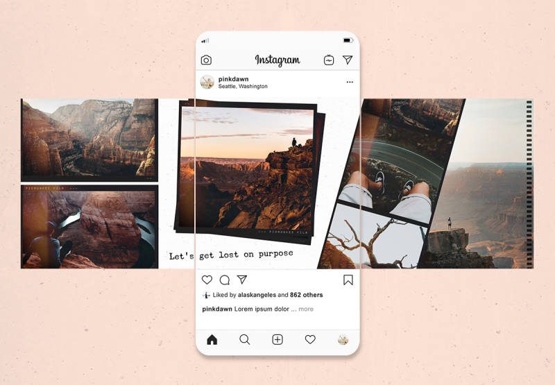
Keep reading to explore more about beautiful Instagram carousel posts.
Beautiful Instagram carousel posts examples
Draw inspiration from these brands and creators on Instagram.
Random House Kids
The children’s publishing arm of Random House knows a thing or two about spinning a story. Here’s how they do it with an Instagram carousel post.
Louise Damas
What’s inside the travel suitcase of jewellery designer Louise Damas’ brand manager? You’ll have to swipe through to find out.
Coachella
If you like the first band featured in Coachella’s Instagram carousel, chances are high you’ll want to see the musicians featured.
Kotn
Explore the textures and fabrics of Kotn with this Instagram carousel. The Canadian brand uses the format to show off and editorialize its apparel.
Mona Chalabi
Data journalist and illustrator Mona Chalabi uses the Instagram carousel to brilliant effect. In this example, the swipe effect conveys both scale and disproportion than any single image could.
Musée des beaux-arts de Montréal
This carousel offers a glimpse at the art and hygiene protocols Musée des beaux-arts de Montréal has put in place to combat virus spread.
Kamwei Fong
Illustrator Kamwei Fong shows you the final product in print and frame, as well as her process—bringing viewers closer to her art one slide and a time.
Welfact
Nothing but the facts, in simple and understandable slides in this and several other Instagram carousels shared by Welfact. To maximize shareability, treat each post as a self-contained unit. That increases the odds (by up to 10!) that someone will share your post in an Instagram story.
Cleanfoodcrush
Who needs a recipe book when you can follow Cleanfoodcrush’s Instagram carousel as instructions for her loaded bean soup.
Chipotle
Chipotle’s timeline of burrito eating uses the Instagram carousel to comical and relatable effect.
Adobe Creative Cloud
Adobe saves #TeddyBearDay with this Instagram carousel tutorial.
Wendy’s
Wendy’s secret menu carousels dare you not to click through and discover “secret” food hacks.
Nike
Timed with Ben Simmons’ NBA Rookie of the Year award win, this post from Nike shows how to use the Instagram carousel to make and punctuate a statement. As one commenter notes: “I love it uses the slide to change perception.”
McDonald’s India
Take a quick look at the McDonald’s India feed and it’s clear that the Instagram carousel has been a winning format for the account. This most, among others, is a good reminder that a “swipe left” call to action never hurts. It helps, in fact. Socialinsider’s study finds the CTA improves engagement.
Air Canada’s enRoute
Why not give the in-flight magazine the “magazine effect.” This Instagram carousel lets you flip through the pages of a mag, just like you would on the plane or in a store.
Delta Air Lines
Break interviews into “sound bites” with Instagram carousels. This can be a good way to share testimonials, employees as ambassadors, artisans, partners, or other interviews you’d like to share.
Patagonia
Patagonia creates a magazine gatefold effect with Instagram carousels. The example demonstrates how carousels can also be used to maintain a feed aesthetic. If you want your feed to only contain images, but also want to share text, here’s a good workaround.


