Have you ever gone through the disappointing feeling when no one is going to show up to your birthday party? Then you know how it feels when no one is swiping up the links on your Instagram Story. Your Instagram stories can get a lot of views, but those just aren’t converting into clicks. Where are they?
Your customers are still on Instagram. Unfortunately, they are swiping up on others’ Stories instead of yours. Don’t take it personally. It’s not you – It’s your stories.
Here, we share with you some effective ways to improve them! And how to make your audiences swipe up instead of swiping through.
7 Reasons Your Instagram Stories Might Not Be Converting
1. Your content is too polished
As the Instagram Feed grew increasingly refined, one perfectly arranged avocado toast post at a time, Stories became a place where audiences expected to see more natural and high-quality content which give them more information.
Based on research from Hootsuite, live-action videos perform better than graphic videos. It’s because content that’s too slick looks out of place and disrupts the user’s experience as they scroll through their Stories.
Similarly, brands like The Guardian found that realistic Stories work more effectively than heavily edited ones.
Even if you’re advertising on Instagram Stories, you should make your videos look not too much like ads. Otherwise, they’ll stand out awkwardly from the other Stories you post and audiences will skip them.
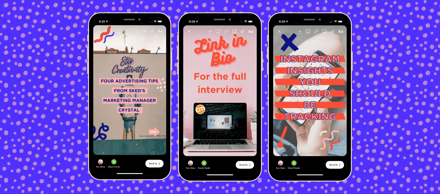
There are some advantages to making your Stories more casual. For one thing, it gives you more opportunities to experiment. As Stories become the dominant format on Instagram, the platform keeps launching more features and formats for you to play enhance your Stories. Including stickers, GIFs and filters can be a great touch that allows your content to look more likely the same as the other Stories your audience is watching.
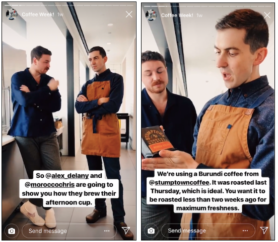
If you’re looking for some examples, Bon Appetit is consistently great at sharing high-quality videos that never seem too stiff or formal.
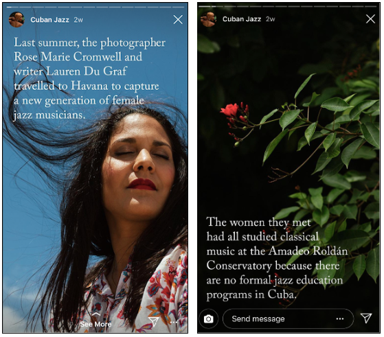
One exception to this rule? If your brand identity is more composed and formal, then your Stories should be formal too. Look at this example from the New Yorker’s Instagram Stories. These stories are aligned with the editorial look and feel of their other content.
2. …or maybe your Stories are too laid-back.
We told you to relax! But, it’s kind of like when your friend tells you to “be yourself” at an important job interview. They don’t mean that you should show up in sweatpants.
It’s important to have a clear visual identity for your business. It will help your audience get to know you, and long-time followers recognize your content immediately. You have a few precious seconds to impress your audience and make them watch your Stories. So, make it easy for them to recognize who you are.
Even if you want to make your Stories look like you are posting them at the moment, preview them first to check how they look. Are they blurry? Have they cropped awkwardly? Does your text have typos? If so, fix them, then share!
While it would be better to have a professional designer or photographer creating your Stories, even only you can produce wonderful content. Anyone can learn to take and edit gorgeous photos using just their smartphone. Or, you could make use of a set of graphic templates.
One last tip: always follow the design specs for Stories, which will make sure that your videos and photos look sharp and clear.
3. Your CTA is not compelling
Okay, you’ve reviewed your Stories and you’re sure that they’re hitting the right balance between polished and casual. However, your audience still isn’t swiping up.
There could be another common problem: your call-to-action isn’t compelling enough.
Without a clear CTA, your audience is likely to move on without knowing that you want them to take more action.
Instagram includes “See More” text to the bottom of Stories that includes links, but that doesn’t give your viewers a lot of information. Swipe up to do what? Buy the pictured product, read a post about it, sign up to find out when it’s available?
When it comes to CTAs, you should be as obvious as Andrew Lincoln holding giant cue cards up for Keira Knightley.
Providing additional context helps make your message clear in the few seconds you have to catch your audiences’ attention.
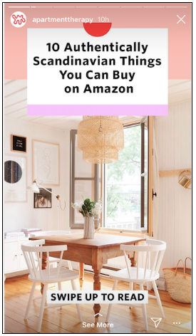
You can also make your CTA bigger and more visible than the “See More” text while keeping your Story’s aesthetic like Apartment Therapy did here:
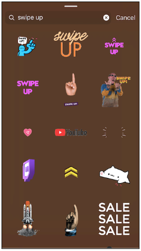
Or use one of the many GIFs or stickers on Instagram that were designed for exactly this purpose. Here are just some options when you search GIFs for “swipe up” options.

