“Do not judge a book by its cover.”
We all know and love that saying. It seems so easy to do, right? Wrong. In fact, that statement is the opposite of what people do. In the business world, how you present yourself matters. On social networks like Facebook and Instagram, your visual aesthetic is the determining factor of your long-term success. Today, we will be focusing on YouTube.
Everybody knows YouTube. YouTube is one of the largest search engines, just right after Google. It also happens to be the second most popular website worldwide. That’s why YouTube marketing is a huge strategy for businesses in every industry. (Don’t even get us started on the magic of YouTube influencers.)
So where does “not judging a book by its cover” come into play with YouTube marketing and advertising? Simply put, the target audience whose attention you’re attempting to capture will judge you based on one important factor: your YouTube thumbnail image.
There are many ways to get free YouTube subscribers and grow your channel. However, people will judge your content by the thumbnail image you show up. You want viewers to actually watch your content. So it is imperative to pay attention to the design, in a way that summarizes your content in a single image.
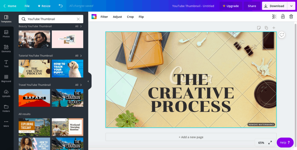
When you upload a new video to YouTube, the system chooses a random frame as a thumbnail. It also gives you the option to upload a custom image that you’ve previously edited on your computer.
Here are several of the best YouTube thumbnail ideas that will help you get more clicks and viewers.
1. Think of the viewer you want to attract
Put yourself in your viewer you want to target. What are their biggest concerns?
They may have too much Internet work to do. So, they don’t have the time. They came across your video, hoping to have their questions answered. Then instantly click to watch your YouTube video because of your brilliantly put-together thumbnail image. Ta-da! You just achieved another viewer.
2. Show a person in your thumbnail image
Thumbnails that show a person performs better than those that don’t. Short shots of people always work well. It is proven that if the thumbnail shows a person looking directly into the viewer’s eyes, it will work even better.
3. Use bright colors
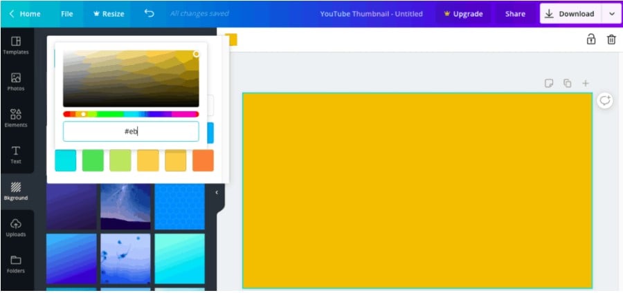
To make your thumbnail miniature stand out, use bright and contrasting colors. Don’t use light colors. In fact, did you know that using the color yellow in your thumbnail can get you more YouTube clicks and views? Thank you, psychology!
4. Take care of the image
Use high definition images. Never upload a blurry one.
You all know that your thumbnail is a JPG, GIF, or PNG. Measuring 1280 x 720 pixels or 1920 x 1080 pixels (16: 9), and weighing less than 2MB.
Make your thumbnail one of the best images you can post up there.
5. Add text
The excellent idea is to add text to your thumbnails; this will show at a glance what the video content is about in an instant.
Text is an efficient design tactic, but don’t go overboard either. Putting more than six words on your thumbnail image would make it look too bulky and blocky. Remember: the color of your text must contrast a lot with the background. If not, it will not be easy to read.
<<< YouTube’s algorithm has changed over time. Here’s what you need to know to put out the best video content and get the most clicks, views, and subscribers. >>>
6. Include your logo
It is always a good idea to add your logo to the thumbnails of your videos.
This way, people can quickly recognize that the video is yours, even when it is embedded outside YouTube.
Your logo is one of the most essential parts to show your brand. Put it everywhere. Let the world know who you are. And one great place to put them in is in your YouTube thumbnail videos.
7. Define your unique style
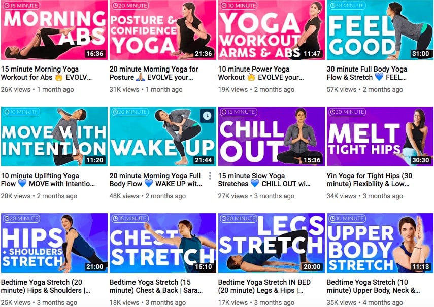
Work on a specific thumbnail style repeated in all your videos so that viewers can quickly identify the videos. This will make you look more consistent and professional.
Each miniature must be different, but plainly you can define colors or design standards that unify the style.
Get inspiration from your competitors, exploring visual search engines like Pinterest, or even doing unconventional methods like reading books or scientific articles. Get your creative juices flowing to find a style that resonates with you.
8. Experiment with different types of design styles
If you make several different types of videos on your channel, another good option is to define a different thumbnail style for every kind of video. You can play with design options like colors. But there are no limits to what you can do.
All your videos will have a thumbnail with a black and white background, but on that background, the video clips will have a green text, and the video lyrics a blue background.
So that when browsing the channel, the viewer knows at all times what type of content each video has.


